The Back to the Future movie poster stands as one of cinema’s most iconic visual artifacts, representing a masterclass in design evolution across three decades of theatrical releases, home video formats, and digital media platforms. From its initial 1985 debut to contemporary re-releases and streaming promotions, the poster’s transformation reflects broader shifts in how studios market films, engage audiences, and adapt imagery for multiple distribution channels. This comprehensive analysis explores the design philosophy, creative decisions, and cultural impact that have made the Back to the Future poster a benchmark for science fiction promotional materials.
Understanding the poster’s evolution requires examining not just aesthetic choices, but the technological, commercial, and cultural contexts that shaped each iteration. The original theatrical release faced different constraints than VHS-era home video marketing, which differed fundamentally from Blu-ray packaging and modern digital streaming thumbnails. Each version tells a story about how the film industry understood audience psychology, design trends, and the medium through which audiences would encounter the image.
The 1985 Original Theatrical Poster Design
The original 1985 Back to the Future poster emerged during a transformative period in film marketing. Theatrical posters of the mid-1980s operated under specific constraints: they needed to grab attention in crowded cinema lobbies, communicate the film’s genre and tone within seconds, and remain visually striking at both large billboard scale and smaller printed formats. The iconic imagery featuring Michael J. Fox’s Marty McFly posed with urgency, the DeLorean positioned as a character itself, and the bold typography established design principles that would influence science fiction marketing for decades.
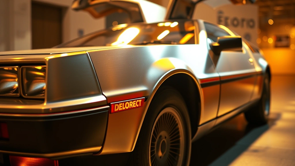
The composition demonstrates sophisticated understanding of visual balance. The positioning of actors occupies the upper portion of the poster, drawing eyes upward initially, while the DeLorean—rendered in metallic silver—anchors the lower section with its distinctive angular silhouette. This spatial arrangement creates diagonal tension that propels the viewer’s gaze across the entire surface, preventing the eye from settling in any single area. The decision to feature the car as prominently as human actors reflected the film’s central premise: the DeLorean wasn’t merely a vehicle but a crucial narrative element and visual symbol.
Color psychology played an essential role in the original design. The warm oranges, yellows, and golden hues dominating the background convey excitement and energy while subtly evoking the film’s time-travel narrative. These warm tones contrast sharply with the cool silver metallic tones of the DeLorean, creating visual separation that emphasizes the car’s otherworldly nature. The deep blue elements provide grounding and stability, preventing the composition from feeling chaotic despite its dynamic energy.
The original poster also established visual hierarchy principles that prioritized immediate genre recognition. Science fiction audiences in 1985 expected specific visual cues: futuristic vehicles, dramatic lighting, bold color contrasts, and energetic compositions. The poster delivered all these elements while maintaining enough visual sophistication to appeal to mainstream audiences unfamiliar with science fiction conventions. This balancing act between genre specificity and broad appeal became the template for the film’s continued marketing across multiple media formats.
Home Video Era Adaptations and VHS Marketing
When Back to the Future transitioned to home video in the late 1980s, the poster underwent significant modifications to accommodate smaller display dimensions and different viewing contexts. VHS box art operated under entirely different visual principles than theatrical posters. The reduced physical size—typically 5 by 8 inches for front cover art—required simplification of complex compositions and amplification of focal points. Designers faced the challenge of ensuring the poster remained visually compelling when viewed at arm’s length on a video rental shelf, competing for attention among hundreds of other titles.
The VHS era introduced multiple poster variants, each optimized for different markets and distribution channels. Some versions emphasized the romantic subplot by positioning Lea Thompson more prominently, appealing to audiences who might be drawn to the film’s interpersonal drama rather than pure science fiction spectacle. Other variants pushed the action-adventure angle, highlighting the urgency of the time-travel plot. This strategic variation reflected how home video marketing acknowledged that different audience segments required different visual appeals.
Technical limitations of VHS packaging also influenced design choices. The printing processes available for mass-produced VHS boxes had less color fidelity than theatrical poster printing, requiring designers to work with more limited palettes and bolder contrasts. Text became more prominent in VHS versions, with larger actor names, movie title treatments, and promotional quotes occupying more poster real estate. The back of the VHS box told additional stories through synopsis text and technical specifications, creating a more comprehensive marketing narrative than theatrical posters allowed.
The DVD era, arriving in the late 1990s, provided opportunities to revisit the original design with improved color reproduction and print quality. DVD packaging embraced higher resolution imagery and more sophisticated color grading. Some DVD releases returned closer to the original theatrical poster aesthetic, while others introduced entirely new artwork that reinterpreted the film’s visual identity for contemporary audiences. The inclusion of special edition releases with alternative artwork gave collectors options and extended the franchise’s visual identity across multiple versions.
Digital Age Redesigns and Modern Interpretations
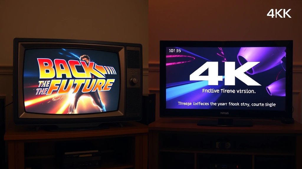
The streaming era fundamentally transformed how films present themselves visually. When Back to the Future became available on platforms like Netflix, Disney+, and other streaming services, the poster transitioned from physical objects to digital thumbnails displayed on screens of varying sizes. This shift required entirely new design approaches. A poster optimized for a 27-inch theatrical presentation looked radically different when compressed to a 4-inch smartphone thumbnail or a 55-inch television screen.
Modern streaming platforms implement sophisticated algorithms that test poster variations against user engagement metrics. Back to the Future imagery has been A/B tested countless times to determine which compositions, color schemes, and focal points drive the highest click-through rates. This data-driven approach contrasts sharply with the intuitive design methods of the 1985 theatrical era. Contemporary poster designers work with detailed information about which visual elements capture attention, hold engagement, and convert viewers into streams.
The ScreenVibe Daily blog covers movie news and frequently discusses how classic films receive updated marketing treatments. Back to the Future exemplifies this phenomenon, with streaming platforms releasing multiple poster versions optimized for different regions, age demographics, and platform specifications. Some versions emphasize nostalgia, targeting viewers who experienced the film in theaters or on home video. Other versions employ contemporary design aesthetics to appeal to younger audiences encountering the film for the first time.
Fan-created and alternative poster designs have proliferated in the digital age, with designers on platforms like DeviantArt and Behance offering reinterpretations of the original. These fan designs often push aesthetic boundaries beyond what official marketing employs, experimenting with minimalism, abstract representations, and stylistic homages to other iconic films. While unofficial, these designs influence how audiences perceive and discuss the film’s visual identity, creating a broader conversation about the poster’s design legacy.
Recent 4K restoration releases have prompted new official poster designs that showcase enhanced image quality and color grading. These versions leverage modern printing technology and digital distribution capabilities to present the film with contemporary visual sophistication. The 4K versions often feature more subtle color gradations, refined typography, and cleaner compositions than earlier iterations, reflecting how technology enables increasingly refined visual presentations.
Color Palette Evolution and Visual Hierarchy
Analyzing the color palette transformations across different poster iterations reveals how design philosophy shifted alongside cultural aesthetics and technological capabilities. The original 1985 poster employed warm, saturated colors that conveyed optimism and adventure—appropriate for a film celebrating American ingenuity and youthful determination. The oranges, golds, and warm yellows created an inviting atmosphere while the cool silvers and blues provided necessary contrast.
VHS-era posters sometimes intensified these color contrasts, compensating for printing limitations by pushing saturation higher. The goal was ensuring colors remained vibrant and distinct even when reproduced on lower-quality printing equipment or viewed under the fluorescent lighting of video rental stores. This sometimes resulted in more garish color schemes than the original theatrical version, sacrificing subtlety for visibility.
DVD and Blu-ray releases permitted returning to more nuanced color palettes. With improved printing fidelity, designers could employ the sophisticated color gradations of the original theatrical poster or create entirely new color schemes that reflected contemporary design trends. Some Blu-ray editions embraced cooler, more minimalist palettes with desaturated backgrounds, contrasting with earlier warm-toned versions.
Streaming platform versions vary dramatically depending on the service’s overall visual branding. Netflix’s interface employs different color treatments than Disney+, and these platform aesthetics influence how Back to the Future poster imagery is presented. A version optimized for Netflix’s dark interface might feature different contrast ratios than one designed for Disney+’s lighter presentation. This platform-specific customization represents a fundamental shift in how classic films maintain visual consistency across distribution channels.
The evolution demonstrates that color isn’t merely decorative but fundamentally communicates the film’s genre, tone, and intended audience. Warm palettes suggest adventure and optimism, while cooler palettes convey technological sophistication and mystery. The Movies HD collection showcases how color presentation impacts viewer perception across different viewing mediums and resolutions.
Typography and Typographic Choices
The evolution of typography across Back to the Future poster versions reflects broader trends in film marketing typography and changing cultural aesthetics. The original 1985 poster employed bold, geometric sans-serif fonts that conveyed modernity and aligned with 1980s design sensibilities. The title treatment featured distinctive letterforms that immediately signaled science fiction genre while remaining highly legible at all sizes.
The typography choices communicated temporal themes central to the film. Forward-leaning letterforms suggested movement and urgency, while geometric precision evoked technological sophistication. The distinctive treatment of “Back to the Future” became so iconic that the font itself became associated with the film, influencing how audiences perceived the entire visual package.
VHS packaging required typography adjustments to accommodate smaller display dimensions. Text sizes increased, letter spacing expanded, and decorative elements sometimes simplified to ensure readability on small boxes viewed from distance. Some VHS versions experimented with different font choices, though most retained the essential character of the original theatrical treatment to maintain brand recognition.
Contemporary versions demonstrate how typography trends have evolved since 1985. Modern poster designs sometimes employ cleaner, more minimalist type treatments that reflect current design fashion. Some versions utilize custom typefaces developed specifically for the film’s various releases, creating visual distinctiveness while maintaining connection to the original iconic treatment. Other designs embrace retro aesthetics, intentionally employing period-appropriate typography to emphasize the film’s 1980s origins.
The typography also reflects how audiences encounter the film through different media. Streaming thumbnails require bold, highly legible typography that functions at tiny sizes, while theatrical re-releases permit more sophisticated, subtle typographic treatments. This responsive typography approach—adapting letterforms and sizing based on display medium—represents a fundamental evolution in how classic films maintain visual consistency across platforms.
Cultural Impact and Collector Appeal
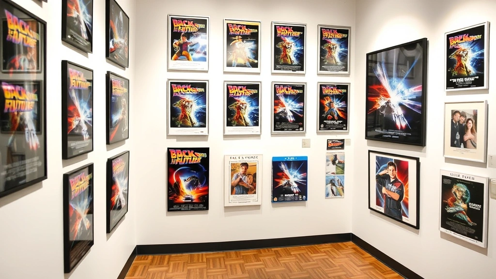
The Back to the Future movie poster has transcended its original function as marketing material to become a cultural artifact with significant collector value. Original 1985 theatrical posters command premium prices in the memorabilia market, with rare variants fetching hundreds or thousands of dollars. This collector appeal reflects how the poster’s cultural significance extends far beyond its role in promoting the film.
The poster’s iconic status stems from multiple factors: the film’s enduring popularity, the distinctive visual design, and the poster’s role in shaping how audiences visually conceptualize 1980s science fiction. Collectors value original theatrical posters for their historical significance, printing quality, and connection to a specific moment in cinema history. The poster serves as a tangible artifact of 1980s graphic design and film marketing practices.
The full movie catalog includes extensive discussion of how classic films maintain cultural relevance through merchandise and memorabilia. Back to the Future posters appear in this context as both functional marketing materials and collectible art objects. Museums and film archives preserve original posters as examples of significant design work, acknowledging their aesthetic and historical importance.
Fan communities have created extensive documentation of poster variations, variants, and regional differences. Online databases catalog different versions with detailed photography, provenance information, and pricing data. This community effort demonstrates how deeply invested audiences are in understanding the poster’s design history and variations. The poster becomes a focal point for discussing the film’s marketing evolution and design philosophy.
Contemporary re-releases and anniversary celebrations frequently introduce new poster designs that appeal to both longtime fans and new audiences. Limited edition prints by renowned designers generate excitement and extend the poster’s cultural relevance into new generations. These anniversary editions often reference the original design while introducing fresh visual perspectives, creating dialogue between past and present aesthetic sensibilities.
Design Lessons for Modern Film Marketing
The Back to the Future poster’s evolution offers valuable lessons for contemporary film marketing professionals. First, the poster demonstrates the importance of clear visual hierarchy and focal point establishment. The original design immediately communicates what audiences should focus on—the car, the characters, the sense of movement and urgency. This clarity remains essential in contemporary marketing where audiences process visual information in seconds.
Second, the poster exemplifies how design must adapt to distribution channels while maintaining core brand identity. The film’s visual identity remained recognizable across theatrical, VHS, DVD, Blu-ray, and streaming formats despite significant design modifications. This balance between consistency and adaptation provides a template for contemporary marketing that must function across multiple platforms simultaneously.
Third, the evolution demonstrates the value of understanding audience psychology and cultural context. The original poster’s warm colors and optimistic energy aligned with 1980s cultural attitudes toward technology and the future. Contemporary versions that adapt these elements to current aesthetic sensibilities show how successful design remains connected to its cultural moment while maintaining timeless appeal.
According to Pew Research Center studies on media consumption, visual design significantly influences how audiences engage with content across platforms. The Back to the Future poster case study demonstrates these principles in practice, showing how thoughtful design choices amplify message effectiveness and cultural resonance.
Modern marketers can learn from the poster’s emphasis on simplicity and directness. Despite its sophistication, the design communicates its message clearly without excessive complexity. The poster doesn’t overwhelm audiences with competing visual elements; instead, it creates a cohesive composition where each element serves a clear purpose. This principle remains essential as contemporary marketing competes for attention in increasingly crowded visual environments.
The poster also illustrates how iconic imagery develops through consistency and strategic repetition. The DeLorean, Marty McFly’s distinctive appearance, and the film’s title treatment became recognizable symbols partly through the poster’s prominence in marketing campaigns. Audiences encountered this imagery repeatedly across multiple media, building familiarity and cultural significance. This principle applies to contemporary marketing: consistent visual presentation across platforms builds recognition and cultural penetration.
FAQ
What makes the original Back to the Future poster iconic?
The original 1985 theatrical poster combines sophisticated design principles with cultural timing. The composition balances character prominence with the iconic DeLorean, the color palette conveys both optimism and technological sophistication, and the typography immediately signals the science fiction genre. The poster’s success stems from clear visual hierarchy, compelling composition, and alignment with 1980s aesthetic sensibilities and technological optimism.
How did the poster change for home video releases?
Home video adaptations required significant modifications to accommodate smaller display dimensions and different viewing contexts. VHS packaging emphasized larger text, simplified compositions, and bolder color contrasts to ensure visibility on rental shelves. DVD and Blu-ray releases permitted returning to more sophisticated color palettes and complex compositions, while streaming versions adapted further for thumbnail display and platform-specific interface aesthetics.
Why do original theatrical posters command such high prices?
Original 1985 theatrical posters represent historical artifacts of significant design and cinema history. Their value reflects rarity, printing quality, condition, and cultural significance. Collectors value these posters as tangible connections to 1980s film marketing, graphic design, and the film’s cultural impact. The poster’s iconic status and enduring popularity ensure sustained collector demand.
How do streaming platforms adapt classic film posters?
Streaming services employ data-driven approaches, testing multiple poster versions against engagement metrics to determine which designs drive highest click-through rates. Versions are optimized for different screen sizes, regional markets, and demographic segments. Platform-specific interface aesthetics influence color treatment, contrast ratios, and composition to ensure maximum effectiveness within each service’s visual ecosystem.
What design principles from this poster remain relevant today?
The poster’s emphasis on clear visual hierarchy, focused composition, and cultural alignment remain essential in contemporary design. The principle of adapting core brand identity across multiple formats while maintaining recognition applies directly to modern multi-platform marketing. The poster demonstrates how thoughtful design communicates effectively, builds cultural resonance, and creates lasting visual impact regardless of technological changes.
Understanding the best movie review sites and how films are discussed culturally provides context for understanding the Back to the Future poster’s significance. The poster functions as a visual touchstone in broader conversations about the film’s legacy and cultural importance.
For those interested in film industry perspectives, The Hollywood Reporter provides extensive coverage of film marketing evolution and poster design trends. Similarly, Deadline covers contemporary film marketing strategies and design innovations that build upon principles established by iconic posters like Back to the Future’s.
The guide to becoming a film critic discusses how visual design influences critical analysis of films. The Back to the Future poster exemplifies how marketing materials contribute to broader cultural narratives about films and their significance.
Additionally, Adweek’s media and marketing coverage frequently analyzes how classic film marketing continues influencing contemporary advertising design and strategy. The Back to the Future poster serves as a reference point for understanding evolution in visual communication across decades.
The collection of famous movie quotes provides cultural context for understanding how Back to the Future achieved iconic status. The poster’s visual design complements the film’s memorable dialogue and quotable moments, creating comprehensive cultural artifacts that ensure the film’s enduring relevance.
The Back to the Future poster’s design evolution represents far more than marketing material adaptation; it documents how visual communication, aesthetic sensibilities, and technological capabilities intersect to create cultural meaning. From its iconic 1985 theatrical debut through contemporary streaming presentations, the poster demonstrates that great design transcends its original context to achieve lasting significance. The principles embedded in this poster’s composition, color choices, and typography continue informing how films are marketed, collected, and remembered in contemporary culture.