Wicked Movie Poster: Expert Design Insights
The Wicked movie poster represents a masterclass in contemporary film marketing, blending theatrical tradition with cutting-edge digital design principles. Released alongside one of 2024’s most anticipated musicals, this poster has become a cultural touchstone that demonstrates how visual storytelling extends far beyond the screen itself. The design choices embedded within this iconic image reveal sophisticated understanding of audience psychology, color theory, and the evolving landscape of movie promotion in the streaming and social media era.
Understanding the design philosophy behind the Wicked poster offers valuable lessons for anyone interested in film marketing, visual communication, or the intersection of art and commerce. From its commanding color palette to its strategic typography and compositional balance, every element serves a calculated purpose in drawing audiences into the magical world of Oz while maintaining commercial appeal across diverse demographics.
Color Psychology and Visual Hierarchy
The dominant color scheme of the Wicked movie poster exemplifies strategic use of color psychology to evoke specific emotional responses. The prominent emerald green background immediately connects viewers to the character of Elphaba and the magical world she inhabits, while simultaneously differentiating this poster from typical Hollywood promotional materials that rely on safer, more neutral backgrounds.
This color choice isn’t arbitrary. Green carries multiple psychological associations: growth, magic, nature, and transformation. For the Wicked narrative, which centers on Elphaba’s journey from misunderstood outsider to powerful witch, the pervasive green serves as visual reinforcement of her arc. The saturation and intensity of the green create what designers call visual dominance, ensuring the poster captures attention even in crowded theater lobbies or scrolling through social media feeds where thousands of promotional images compete for eyeballs.
The contrast between the green background and the warm skin tones of the characters creates what color theorists term complementary tension. This tension isn’t jarring; instead, it creates visual interest and prevents the poster from feeling flat or monotonous. The strategic placement of lighter elements—including the characters’ faces and costume highlights—against the darker green establishes clear focal points that guide the viewer’s eye in a deliberate sequence.
Understanding these principles proves essential for anyone studying contemporary film marketing trends, as color choices have measurable impacts on box office performance and audience perception. Research in visual communication demonstrates that posters employing strategic color psychology generate higher engagement rates across both traditional and digital platforms.
Typography and Textual Elements
The typography featured in the Wicked movie poster balances theatrical elegance with modern readability. The title treatment employs a typeface that evokes theatrical tradition—reminiscent of classic Broadway marquees—while maintaining clean legibility across multiple viewing distances and digital formats.
Font selection in movie posters serves multiple functions simultaneously. First, it must be instantly recognizable, allowing audiences to identify the film at a glance. Second, it must communicate tone and genre through visual language alone. The Wicked poster’s typography accomplishes both through its combination of serif elements suggesting classical theater with subtle modern refinements that signal contemporary production values.
The hierarchical arrangement of text—with the title as the dominant element, followed by supporting text regarding release dates, production credits, and promotional taglines—follows established conventions of poster design while maintaining visual balance. This hierarchy ensures that even viewers with peripheral exposure to the poster absorb the essential information about what film is being promoted.
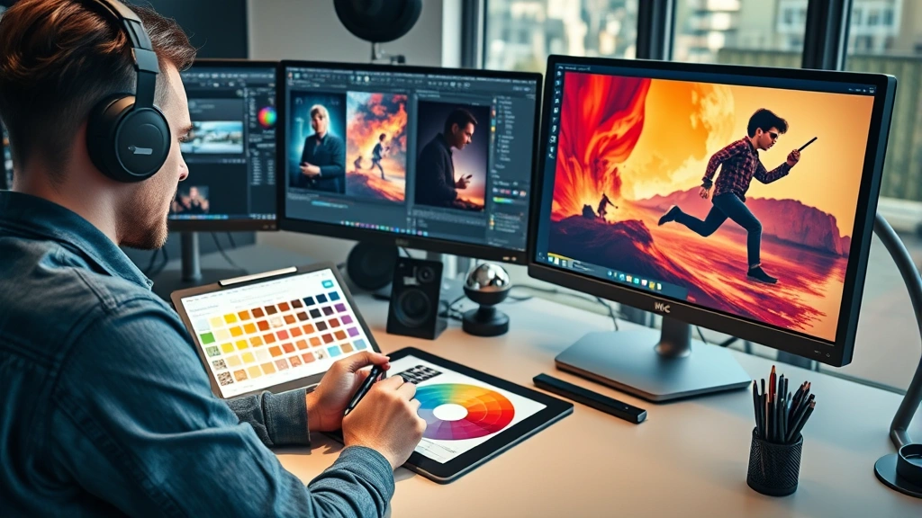
Spacing and kerning (the adjustment of space between letters) demonstrate meticulous attention to detail. Poor typography can undermine even the most stunning visual artwork, while excellent typography elevates the entire composition. The Wicked poster maintains professional standards that reflect the substantial budget and expertise invested in major studio marketing campaigns.
” alt=”Digital designer working on movie poster layout with typography tools and color swatches visible on computer monitor in modern creative studio environment” style=”max-width: 100%; height: auto;”>
Compositional Balance and Character Placement
The spatial arrangement of characters within the Wicked movie poster reflects sophisticated understanding of composition principles developed across centuries of visual art. The primary characters are positioned to create visual balance while establishing clear narrative hierarchy—the most important characters receive prominent placement, larger scale, and more direct eye contact with viewers.
Character placement serves multiple strategic purposes. It communicates character importance within the story hierarchy, guides viewer attention in a deliberate sequence, and creates emotional resonance through spatial relationships. The positioning of Elphaba and Glinda relative to each other, for instance, visually represents their complex relationship while maintaining compositional balance.
The use of diagonal lines—whether created through character poses, costume elements, or background design—creates dynamic energy that prevents the poster from feeling static. This dynamism proves particularly important in the context of contemporary media consumption, where promotional materials compete in fast-moving digital environments. A static poster risks being scrolled past; a dynamically composed poster captures and holds attention.
The rule of thirds—a compositional principle suggesting that images should be divided into nine equal parts with important elements placed along these lines—appears to inform the Wicked poster’s composition. This creates naturally pleasing proportions that feel balanced without appearing mathematically rigid or artificial.
Thematic Symbolism in Design
Beyond surface aesthetics, the Wicked movie poster operates on a symbolic level that rewards deeper analysis. Every design choice communicates thematic elements central to the musical’s narrative about perspective, morality, and the construction of villainy.
The visual representation of Elphaba—specifically her green skin and darker costume—immediately signals her status as the outsider, the character society has deemed evil. Yet the poster’s composition and lighting treat her with dignity and power, suggesting a more complex narrative than simple good-versus-evil binaries. This visual complexity mirrors the musical’s central theme: questioning accepted narratives and exploring the humanity of those labeled as villains.
Costume design visible in the poster communicates character and historical period. The theatrical nature of the costumes—with their exaggerated proportions and vibrant colors—signals that viewers are entering a fantastical world distinct from everyday reality. This aesthetic choice immediately differentiates Wicked from grittier, more naturalistic films and sets appropriate expectations about tone and style.
Lighting design in the poster creates drama and atmosphere while serving practical purposes. Strategic highlighting of faces ensures character recognition while creating the theatrical, slightly surreal lighting that characterizes stage productions. This lighting choice helps bridge the gap between theatrical source material and cinematic adaptation, maintaining visual connection to Broadway while embracing film’s technical capabilities.
Marketing Strategy and Audience Targeting
The Wicked movie poster functions as a multifaceted marketing tool designed to appeal to diverse audience segments while maintaining cohesive visual identity. This requires balancing competing demands: attracting longtime Broadway fans, reaching younger audiences unfamiliar with the musical, and appealing to general audiences who appreciate spectacle and romance.
The poster’s design achieves this balance through several strategic choices. The theatrical elements appeal to Broadway aficionados and musical theater enthusiasts. The contemporary visual style and production values signal that this represents a major studio film with significant resources invested in quality. The emphasis on character beauty and emotional expression appeals to audiences seeking romance and personal drama alongside spectacle.
Understanding target demographics proves essential in modern film marketing. Different audience segments respond to different visual and textual cues. The Wicked poster manages to incorporate multiple appeals without appearing fragmented or confused about its identity—a delicate balance that separates successful promotional campaigns from mediocre ones.
The poster’s design also considers where and how it will be displayed. Theater lobby posters, subway advertisements, digital social media versions, and streaming platform thumbnails all require slightly different treatments. Successful poster design anticipates these various contexts and maintains visual impact across all formats. The Wicked poster achieves this through strong central imagery that remains compelling at any size or aspect ratio.
For those interested in the broader context of film marketing, examining how studios market to different family demographics reveals similar strategic considerations across the industry.
Comparison with Classic Movie Posters
The Wicked movie poster exists within a rich historical context of film promotional art. Examining how it compares to classic movie posters from different eras reveals both continuities in design principles and evolution reflecting contemporary aesthetic preferences.
Classic Hollywood posters from the golden age often employed hand-painted artwork, featuring glamorous star headshots, dramatic lighting, and bold typography. These posters emphasized star power and used illustration techniques that conveyed elegance and aspiration. The Wicked poster maintains this emphasis on character prominence and glamorous presentation while employing digital techniques and contemporary color grading that reflect modern production capabilities.
Posters from the 1970s and 1980s frequently experimented with more abstract compositions and surrealist imagery, reflecting broader cultural shifts toward challenging conventional aesthetics. The Wicked poster borrows from this tradition through its use of non-naturalistic color—the pervasive green—while maintaining enough representational clarity that audiences immediately understand they’re viewing a film about recognizable characters in a fantastical world.
Contemporary movie posters increasingly prioritize visual clarity and legibility across multiple platforms. The shift from exclusively printed physical posters to digital-first promotional strategies has influenced design choices. The Wicked poster reflects this evolution through its consideration of how the design will function as a small thumbnail on streaming platforms, a large billboard, and everything in between.
The theatrical tradition of the Wicked musical influences the poster’s connection to classic theatrical design principles. Broadway posters have long emphasized dramatic lighting, character presentation, and visual spectacle. The film poster honors these traditions while translating them into cinematic language—a respectful evolution rather than abandonment of source material aesthetics.
Digital Adaptation Across Platforms
Modern film posters must function effectively across radically different platforms and contexts. The Wicked movie poster demonstrates sophisticated understanding of how visual designs must be adapted for different digital and physical environments while maintaining core identity.
On social media platforms like Instagram, TikTok, and X (formerly Twitter), the poster appears as a vertical or square image competing with thousands of other promotional images, user-generated content, and entertainment news. The strong central composition, recognizable characters, and bold color palette ensure the poster captures attention even at small sizes and in crowded feeds.
For streaming platform integration, where the poster appears as a thumbnail alongside other film options, the design must be instantly distinguishable from competitors. The distinctive green color serves this function perfectly, creating immediate visual differentiation in browsing interfaces. Users scrolling through available films can identify the Wicked poster instantly, even at sizes where fine details become illegible.
Physical applications—theater lobbies, billboards, transit advertising—require different considerations. These larger formats allow for fine detail appreciation and command sustained attention from audiences. The poster design scales beautifully to these applications, revealing additional compositional sophistication and artistic detail visible only at larger sizes.
The poster’s design also anticipates how it will be shared and remixed within fan communities. Contemporary film marketing recognizes that audiences actively participate in promotional culture through creating memes, redesigns, and fan art. The Wicked poster’s strong visual identity and recognizable elements provide excellent raw material for this participatory culture, extending its marketing reach beyond official studio efforts.
Understanding how promotional materials function across digital platforms represents essential knowledge for anyone involved in contemporary film criticism and analysis. The technical and strategic considerations involved in poster design intersect with broader questions about how films are marketed, consumed, and discussed in digital culture.
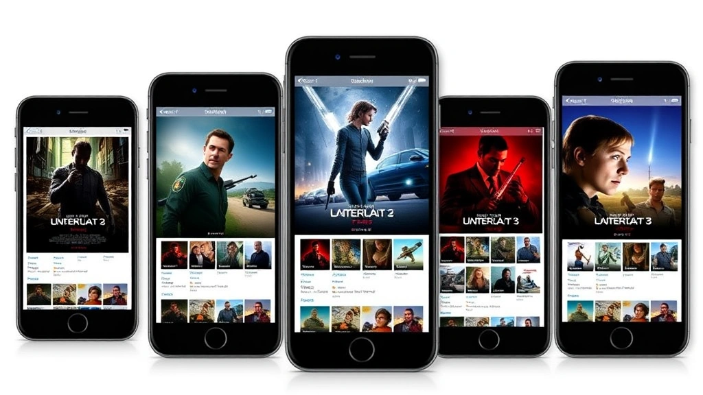
” alt=”Multiple smartphone screens displaying movie poster variations and thumbnails in different aspect ratios and sizes showing responsive design adaptation” style=”max-width: 100%; height: auto;”>
FAQ
What makes the Wicked movie poster visually distinctive?
The poster’s distinctive emerald green background immediately differentiates it from typical Hollywood promotional materials. This color choice serves multiple functions: it connects viewers to Elphaba’s character, creates psychological associations with magic and transformation, and ensures the poster stands out in crowded visual environments. Combined with the theatrical lighting, character placement, and contemporary digital production techniques, these elements create a visually distinctive poster that feels both rooted in theatrical tradition and firmly contemporary.
How does the poster appeal to different audience segments?
The Wicked poster strategically incorporates multiple appeals: theatrical elements attract Broadway enthusiasts, the contemporary visual style signals major studio production quality, the emphasis on character beauty and emotional expression appeals to audiences seeking romance and drama, and the fantastical aesthetic attracts those seeking spectacle and escapism. This multifaceted approach allows the poster to function as an effective marketing tool across diverse demographic groups without appearing confused about its target audience.
Why is color psychology important in movie poster design?
Color psychology influences how viewers emotionally respond to visual stimuli. The specific green used in the Wicked poster carries associations with magic, growth, transformation, and nature—all thematically relevant to the story. Strategic use of color creates visual hierarchy, guides viewer attention, establishes mood, and creates emotional resonance. Research demonstrates that color choices measurably impact audience engagement and box office performance, making color psychology a crucial consideration in professional poster design.
How does the poster function across different platforms?
The Wicked poster demonstrates sophisticated platform-aware design that functions effectively as a small social media thumbnail, a large theater lobby display, a streaming platform thumbnail, and a transit advertisement. The strong central composition, distinctive color palette, recognizable characters, and clear visual hierarchy ensure the design maintains impact regardless of size or display context. This adaptability reflects essential considerations in contemporary film marketing.
What design principles does the poster employ?
The Wicked poster employs multiple established design principles including the rule of thirds (compositional balance), color psychology (emotional resonance and visual hierarchy), visual hierarchy (directing viewer attention), dynamic composition (diagonal lines and character poses creating energy), typography hierarchy (clear information organization), and symbolic representation (thematic visual communication). Understanding these principles provides insight into how professional designers create visually compelling and functionally effective promotional materials.
How does the theatrical source material influence the poster design?
The Wicked musical’s Broadway origins significantly influence the poster’s aesthetic. The theatrical lighting, character presentation, and emphasis on visual spectacle reflect traditional theatrical design principles. However, the poster translates these theatrical elements into cinematic language appropriate for film audiences. This respectful evolution maintains visual connection to the beloved stage musical while embracing film’s technical capabilities and contemporary visual conventions.