Horror Movie Posters: Design Trends Explained
Horror movie posters represent one of cinema’s most compelling visual languages, communicating dread, intrigue, and artistic innovation within a single frame. These designs have evolved dramatically over decades, reflecting shifting cultural anxieties, technological capabilities, and audience expectations. From hand-painted artwork to digitally rendered nightmares, horror poster design has become a specialized art form that deserves serious critical attention.
The poster serves as a film’s first impression—a visual contract between filmmaker and viewer. In horror specifically, this contract promises terror, psychological unease, or visceral shock. Understanding how designers craft these promises through color, typography, imagery, and composition reveals deeper truths about how horror functions as a medium and how marketing shapes our relationship with fear itself.
The Evolution of Horror Poster Design
Horror movie posters didn’t emerge fully formed—they evolved alongside the genre itself. During cinema’s silent era, promotional materials relied on painted illustrations and theatrical sensibilities. Early horror films like Nosferatu (1922) and The Cabinet of Dr. Caligari (1920) featured posters with expressionistic distortion, reflecting the artistic movements influencing filmmakers. These weren’t designed to scare; they were designed to intrigue through artistic sophistication.
The 1930s and 1940s brought Hollywood’s golden age of horror, and posters followed suit. Universal’s monster films—Frankenstein, The Mummy, Dracula—featured dramatic painted artwork showcasing the creature or monster as the central focal point. These designs prioritized clarity and recognizability, understanding that audiences needed to know exactly what terror awaited them. The aesthetic emphasized grandeur and theatrical presentation.
By the 1950s and 1960s, horror posters began experimenting with abstraction and psychological imagery. Psycho‘s famous poster used stark black and white with jagged lines suggesting violence and fragmentation. This era introduced the concept that horror could be suggested rather than shown, that the viewer’s imagination could be manipulated through design choices rather than explicit imagery.
The 1970s and 1980s represented a watershed moment. Practical effects became more sophisticated, and posters reflected this with increasingly graphic imagery. Slasher film posters featured weapons, blood, and victims in more explicit compositions. Yet simultaneously, films like The Exorcist proved that restraint could be more effective—that poster featured a simple silhouette against darkness, letting ambiguity do the heavy lifting.
Understanding how film critics evaluate horror marketing requires recognizing these historical patterns and how contemporary designers reference, subvert, or honor them.
Color Psychology in Horror Marketing
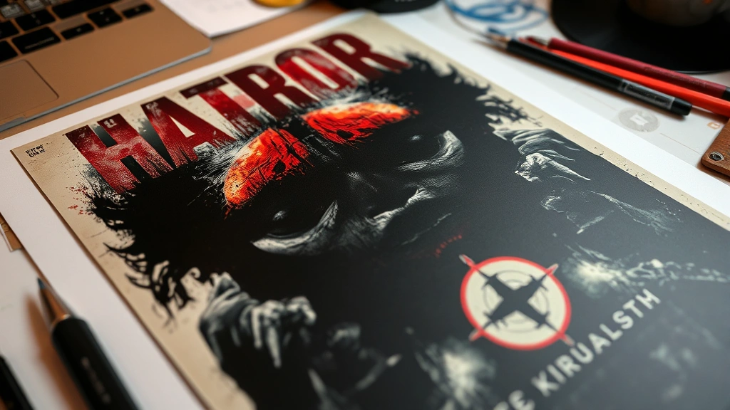
Color choice in horror movie posters operates on both psychological and cultural levels. Red dominates horror marketing—it signifies blood, danger, passion, and transgression. Yet red’s effectiveness varies contextually. A poster drenched in pure red might feel more action-oriented than horrifying, while red used sparingly against darkness creates visceral impact. Suspiria‘s poster demonstrates this principle: red light cutting through darkness suggests violence without showing it directly.
Black remains horror’s foundational color, representing death, the unknown, and psychological void. Posters employing predominantly black compositions create a sense of emptiness and dread. When combined with minimal other colors, black backgrounds amplify whatever imagery appears—a face, a weapon, a shadow—making it loom larger in the viewer’s consciousness.
Yellow and green occupy interesting positions in horror design. Yellow’s association with sickness, radiation, and corruption makes it effective for body horror or supernatural films. The Exorcist famously featured yellowish tones suggesting supernatural corruption. Green similarly suggests decay, disease, and otherworldliness. These colors feel “wrong” to human perception—they’re colors we don’t expect to dominate natural scenes, making them inherently unsettling.
Desaturated palettes—grays, browns, muted teals—have gained prominence in contemporary horror marketing. These create a sense of lifelessness and authenticity, suggesting documentary-style realism rather than theatrical spectacle. This trend reflects broader shifts in how horror addresses contemporary anxieties: environmental collapse, pandemic fears, and social decay manifest through color palettes suggesting deterioration and depletion.
White rarely dominates horror posters, yet when used strategically—white faces, white eyes, white text—it creates jarring contrast that catches attention and suggests wrongness. Albinism and pallor have long symbolized supernatural threat or inhuman otherness in visual culture, and horror designers leverage this effectively.
[IMAGE_1]
Typography and Lettering Techniques
Typography in horror posters communicates tone before a single image registers. Serif fonts suggest classical horror and gothic tradition—they reference old books, ancient evil, and established cultural anxieties. Sans-serif fonts feel more contemporary and clinical, useful for modern horror or sci-fi-inflected terror. Hand-drawn or distressed lettering introduces instability and psychological unease, suggesting deterioration or madness.
Distortion techniques have become increasingly sophisticated. Letters might appear melting, stretching, or fragmenting. Layered transparency creates depth and ghostliness. Some contemporary posters use glitch effects—digital artifacts and corrupted letterforms—referencing technology-based horror and digital-age anxieties.
Capitalization choices matter significantly. All-caps text suggests aggression and demands attention, while mixed case feels more naturalistic. Some horror posters deliberately use lowercase lettering, creating an almost whispered quality—the opposite of shouting, yet somehow more disturbing through its restraint and intimacy.
Color contrast with typography proves crucial. White text on black backgrounds offers maximum legibility but feels formal and classical. Red text suggests urgency and violence. Text that’s barely legible—nearly matching background colors—creates frustration and unease, forcing viewers to work to read the title, a technique that mirrors the psychological labor horror demands.
Placement of typography affects composition entirely. Some posters feature title text dominating the composition, while others hide it within imagery or relegate it to minimal placement. The trend toward minimalist text reflects confidence in visual storytelling and recognition that audiences will seek title information if the image compels them sufficiently.
Imagery and Visual Symbolism
Horror poster imagery operates through cultural symbol systems that audiences intuitively understand. Certain visual elements carry encoded meaning: masks suggest hidden threat and dehumanization, mirrors suggest doubling and psychological fracture, water suggests drowning and the subconscious, darkness suggests the unknown and death itself.
Faces dominate horror posters because faces trigger immediate emotional recognition. A distorted face, a missing face, or a face emerging from shadow activates primal fear responses. Contrastingly, some effective horror posters feature no faces at all—only negative space, shadows, or abstract forms suggesting human presence without showing it.
Body horror imagery has increased in prominence, reflecting contemporary anxieties about bodily autonomy, illness, and biological transgression. Posters featuring twisted limbs, exposed viscera, or body transformation communicate visceral threat directly. Yet the most effective body horror imagery often suggests rather than shows—a hand emerging wrongly from shadow, a silhouette with impossible proportions.
Environmental imagery carries symbolic weight. Isolated houses suggest domestic violation and nowhere-to-run vulnerability. Forests communicate nature’s indifference and human smallness. Urban decay suggests social collapse and institutional failure. Religious imagery—crucifixes, demonic symbols, angelic figures corrupted—taps into spiritual anxiety and transgression against sacred spaces.
Animal imagery appears frequently: insects suggesting invasion and violation of bodily boundaries, predators suggesting natural threat, birds suggesting otherworldliness and omen. These animals often appear distorted, oversized, or in impossible configurations, emphasizing the supernatural corruption of natural order.
Contemporary Design Trends
Modern horror poster design reflects contemporary anxieties and technological possibilities. The “elevated horror” movement—films prioritizing psychological complexity over gore—has influenced poster design toward suggestion and ambiguity. Contemporary horror available on streaming platforms often features posters emphasizing atmosphere over spectacle, recognizing that different distribution channels demand different marketing approaches.
Photorealism has become increasingly dominant. Rather than painted artwork or illustration, contemporary posters often feature highly detailed photography, sometimes manipulated digitally. This hyperrealism creates uncanny valley effects—the images appear almost real but contain subtle wrongness that disturbs viewers precisely because it’s nearly photographic.
Symmetry and geometric composition have emerged as significant trends. Rather than chaotic or dynamic arrangements, some contemporary posters employ rigid symmetry, suggesting control, order, and psychological precision. This mirrors horror’s increasing interest in psychological manipulation and institutional threat rather than purely supernatural or slasher-based narratives.
Retro-influenced design has gained traction, with contemporary filmmakers and designers deliberately referencing 1970s and 1980s aesthetics. This nostalgia marketing works because those eras produced iconic horror imagery that audiences recognize and trust. Simultaneously, it suggests that contemporary horror connects to proven traditions of the form.
International poster variations have become more visible through digital distribution and fan communities. Seeing how the same film receives entirely different poster treatments in different countries reveals how horror marketing adapts to cultural contexts and audience expectations. Japanese horror posters often emphasize psychological suggestion and supernatural ambiguity, while American posters frequently prioritize explicit threat and recognizable genre elements.
Social media optimization has influenced poster design. Posters must work as thumbnail images on streaming platforms and social feeds, forcing designers to prioritize high contrast, clear focal points, and designs that read at small scales. This has paradoxically encouraged both bolder, simpler compositions and more intricate details designed to reward close examination.
Minimalism vs. Maximalism Approaches
Horror poster design exists on a spectrum between minimalist restraint and maximalist excess. Minimalist approaches trust viewers’ imagination and cultural knowledge. A single element—a pair of eyes, a knife, a door—against negative space creates psychological tension through suggestion. The Witch‘s poster exemplifies this: minimal imagery suggesting isolation and supernatural threat without showing explicit horror.
Maximalist approaches assault viewers with information and imagery. Multiple visual elements compete for attention, creating visual chaos that mirrors psychological chaos. Slasher film posters frequently employ maximalism—multiple victims, weapons, blood, and threat indicators all competing visually, creating cognitive overload that communicates the film’s chaotic violence.
The trend currently favors minimalism, reflecting broader design movements and the influence of international horror cinema. Yet this varies by subgenre: body horror films often embrace maximalist imagery, while psychological horror increasingly employs minimalist approaches. Horror film criticism and analysis increasingly examines how these design choices communicate thematic content.
Effective minimalist design requires exceptional visual clarity and symbolic resonance. Every element must carry maximum meaning. Maximalist design requires sophisticated composition to prevent total visual chaos—the designer must guide the viewer’s eye through complexity despite apparent disorder.
The Role of Negative Space
Negative space—the empty area surrounding primary imagery—functions as active design element rather than passive absence. In horror posters, negative space creates psychological breathing room that amplifies whatever occupies the composition’s center. Surrounding a face with vast darkness makes that face loom larger psychologically.
Negative space communicates isolation and vulnerability. A small figure against enormous empty space suggests human insignificance against cosmic or supernatural threat. This design choice appears frequently in science fiction horror and cosmic horror adaptations, where the universe’s indifference represents the ultimate threat.
Yet negative space can also communicate claustrophobia and confinement. Minimal negative space, with imagery pressing against composition edges, creates tension through visual crowding. This approach suits haunted house narratives or psychological horror where threat emerges from proximity and inescapability.
Color of negative space matters substantially. Black negative space suggests void and death. White negative space suggests sterility and wrongness. Colored negative space (red, green, yellow) actively communicates mood and psychological state. Some contemporary posters use gradient negative space, transitioning from one color to another, creating visual movement and instability.
Asymmetrical composition—where imagery doesn’t center within negative space—creates unease. Symmetrical composition, with imagery centered and balanced negative space on all sides, creates formal perfection that can feel either classical and controlled or uncannily precise and inhuman depending on context.
FAQ
What makes an effective horror movie poster?
Effective horror posters communicate threat, intrigue, or psychological unease within seconds while remaining memorable and distinctive. They balance clarity with ambiguity, showing enough to inform viewers while leaving room for imagination. Strong design employs color psychology, symbolic imagery, and composition choices that guide viewer attention and emotional response. The poster must work at multiple scales—from theatrical display to streaming thumbnail—while reflecting the film’s specific brand of horror.
How have horror posters changed with streaming platforms?
Streaming platforms have fundamentally altered horror poster design. Theatrical posters could rely on size and presence to impact viewers; streaming posters must communicate instantly at thumbnail scale. This has encouraged bolder color choices, higher contrast, and clearer focal points. Simultaneously, streaming allows for regional variations and rapid iteration—platforms can test different poster designs and optimize based on click-through data. This data-driven approach influences design toward proven emotional triggers rather than artistic experimentation.
Why do so many horror posters use red and black?
Red and black carry powerful cultural associations: red signifies blood, danger, and transgression, while black represents death, the unknown, and void. These colors trigger immediate emotional responses grounded in survival instinct. Additionally, red and black contrast dramatically, ensuring visibility and psychological impact. This combination has become somewhat formulaic, leading some contemporary designers to deliberately subvert expectations by using unexpected color palettes.
What’s the difference between international horror poster styles?
Different regions emphasize different horror elements. American posters often prioritize explicit threat and recognizable genre elements, while Japanese posters frequently emphasize psychological suggestion and supernatural ambiguity. European posters often embrace artistic abstraction and formal sophistication. These differences reflect cultural attitudes toward horror, marketing conventions, and audience expectations. Understanding these variations reveals how horror functions differently across cultural contexts.
How do designers balance showing and suggesting in horror posters?
The most psychologically effective horror posters understand that imagination often surpasses explicit depiction. Showing everything eliminates mystery; suggesting threat allows viewers to project their own fears onto the image. Effective designers use composition, negative space, and visual ambiguity to create interpretive space. A shadowy figure might suggest multiple threats simultaneously; an obscured face leaves details to imagination. This balance varies by subgenre—slasher films typically show more explicitly, while psychological horror relies on suggestion.
Are hand-painted posters more effective than digital designs?
Both approaches have advantages. Hand-painted posters carry artistic authority and tactile quality that resonates emotionally. Digital design allows for precision, iteration, and complex layering. Contemporary practice often combines both: digital painting techniques simulate hand-drawn qualities while maintaining digital flexibility. The effectiveness depends on execution and contextual appropriateness rather than medium choice alone.
For comprehensive understanding of how film marketing functions broadly, exploring critical perspectives on movie marketing provides valuable context. Additionally, examining how films communicate through language and dialogue complements understanding of visual communication strategies. For those interested in broader film analysis, understanding adaptation and interpretation reveals how source material influences marketing approaches including poster design.
Horror movie poster design represents a sophisticated visual language that communicates complex psychological and cultural information instantly. These designs function as visual arguments about what horror means in specific historical moments, what audiences fear, and how cinema packages transgression for consumption. By understanding design trends—from color psychology to composition choices to typography—we develop deeper appreciation for how horror marketing shapes our relationship with fear itself. The most effective horror posters don’t merely advertise films; they extend the horror experience into the viewer’s consciousness before the film even begins, priming psychological responses that the film then manipulates. This collaborative relationship between poster design and cinematic experience makes horror poster analysis essential for understanding contemporary horror cinema.
External resources for deeper exploration include Pew Research Center’s media studies, which provides data on visual marketing effectiveness, Hollywood Reporter’s design analysis covering contemporary poster trends, Art of the Movie Poster featuring historical and contemporary examples with designer commentary, Creative Boom’s design journalism analyzing poster campaigns, and academic research on visual communication and psychology providing theoretical frameworks for understanding design’s psychological impact.